|
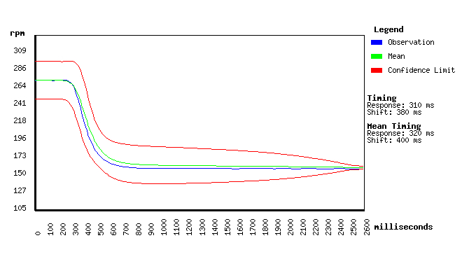
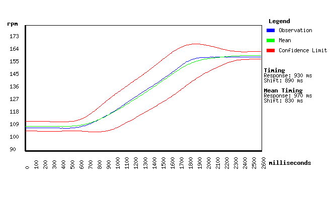
As can be seen above, these charts display how your transmission performed when being operated during the dynadrome test. The red lines are statistically calculated limits based upon the performance of known good transmissions. The green line is the mean, or average, performance of all the known good transmissions. The blue line is the performance of your transmission. These values are calculated and observed at every one-thousandth of a second through every upshift and downshift of your transmission. Confidence you can rely on that your transmission is performing correctly at any point during an upshift or downshift. As with all of our quality control systems, the values are calculated automatically during the night and installed into the system when finished. Continuous improvement is a key foundation of our quality control system and is automatically built into the software system we designed. |

